Introduction
The easiest way to add a timeline to your Divi site without tons of CSS. With the Divi Timeline module from Divi Modules Pro, you can easily add a timeline and just focus on style it 😍
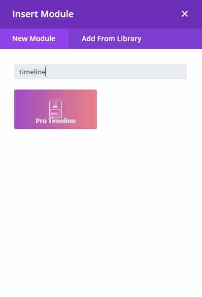
Step 1: Add a new module
1. Enable Divi Builder and add a new Module > Search for “Timeline”.
(make sure the Timeline Module is enabled under the Divi Modules Pro Control Panel)
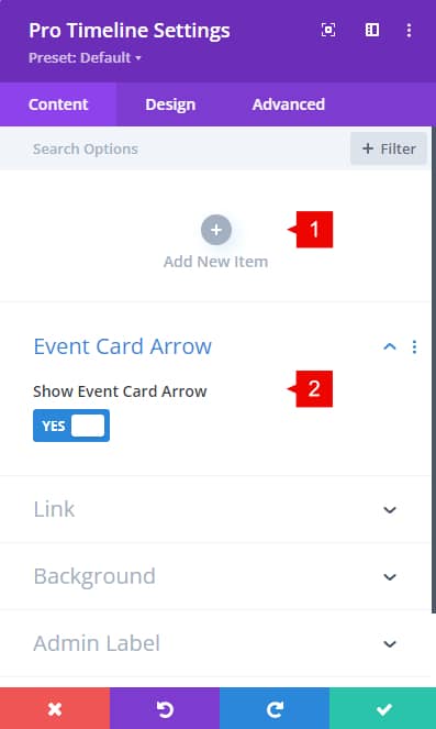
Timeline – Content Tab
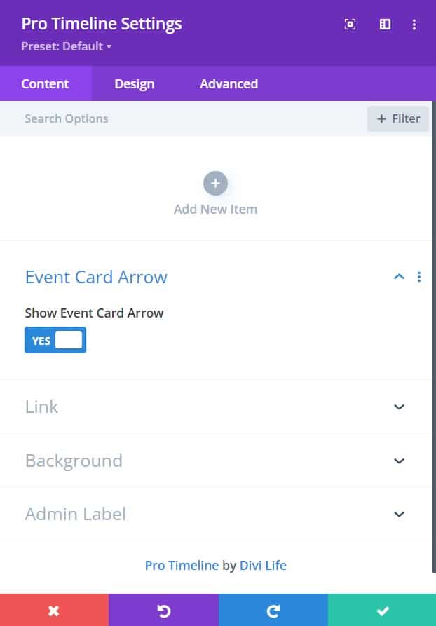
1. Add new item: Add new timeline events. Once you add a new timeline event, a new content tab will be opened (check below).
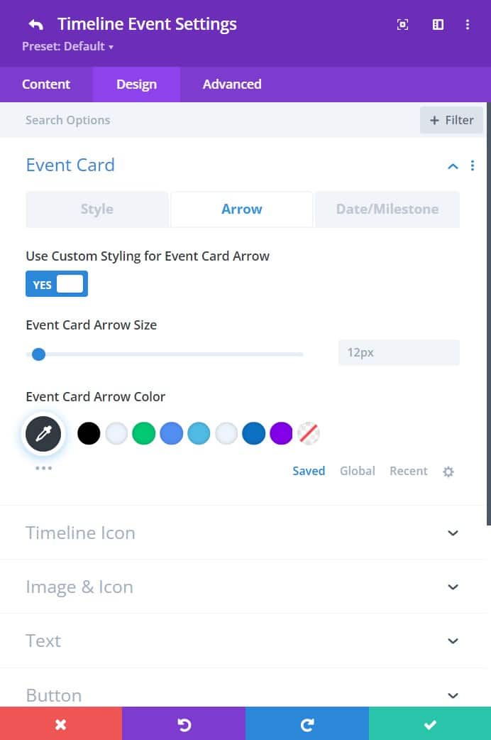
2. Show Event Card Arrow: Show an arrow at the left/right of the content box. This can be styled on the design tab (check below)
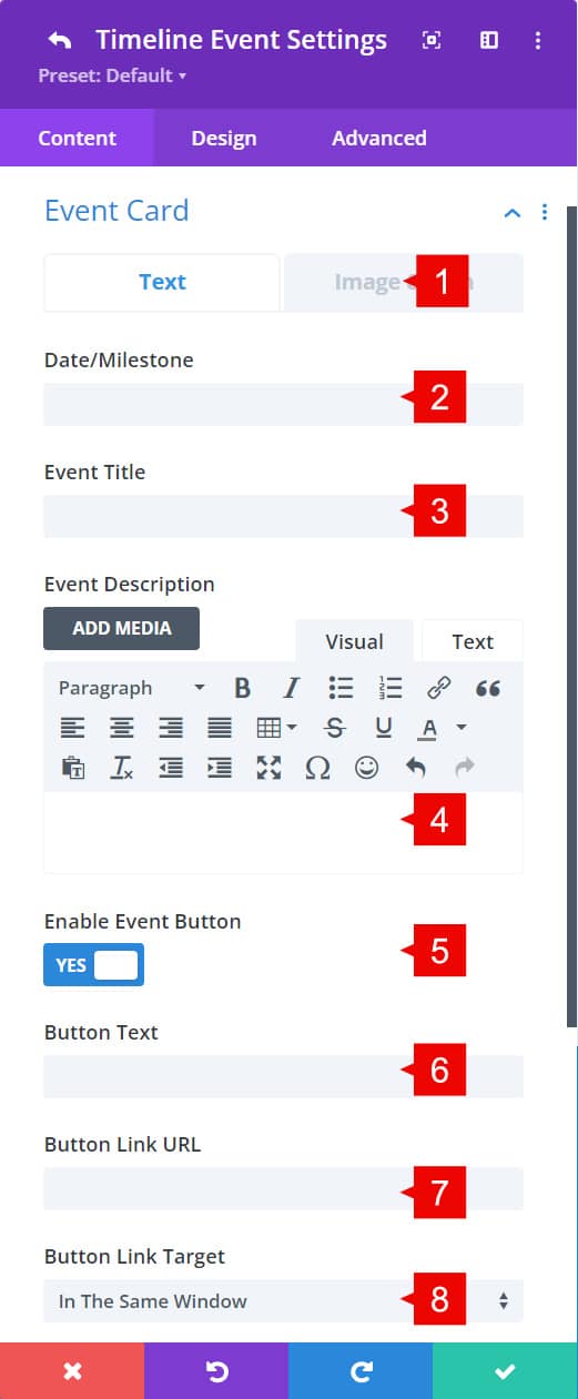
Timeline – New Card Content Tab
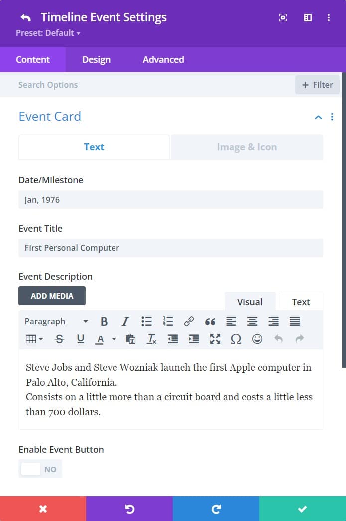
1. Text: In this section, you’ll add the text of the event card.
2. Date/Milestone: Add the date for this specific event card.
3. Event Title: Add the title for this specific event card.
4. Event Description: Add the description for the event card.
5. Event Button: Add a button to the event card.
6. Button text: Text for the button added within the card.
7. Button Link URL: the custom URL for the button added.
8. Target: open the link on the same or new page.
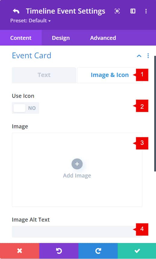
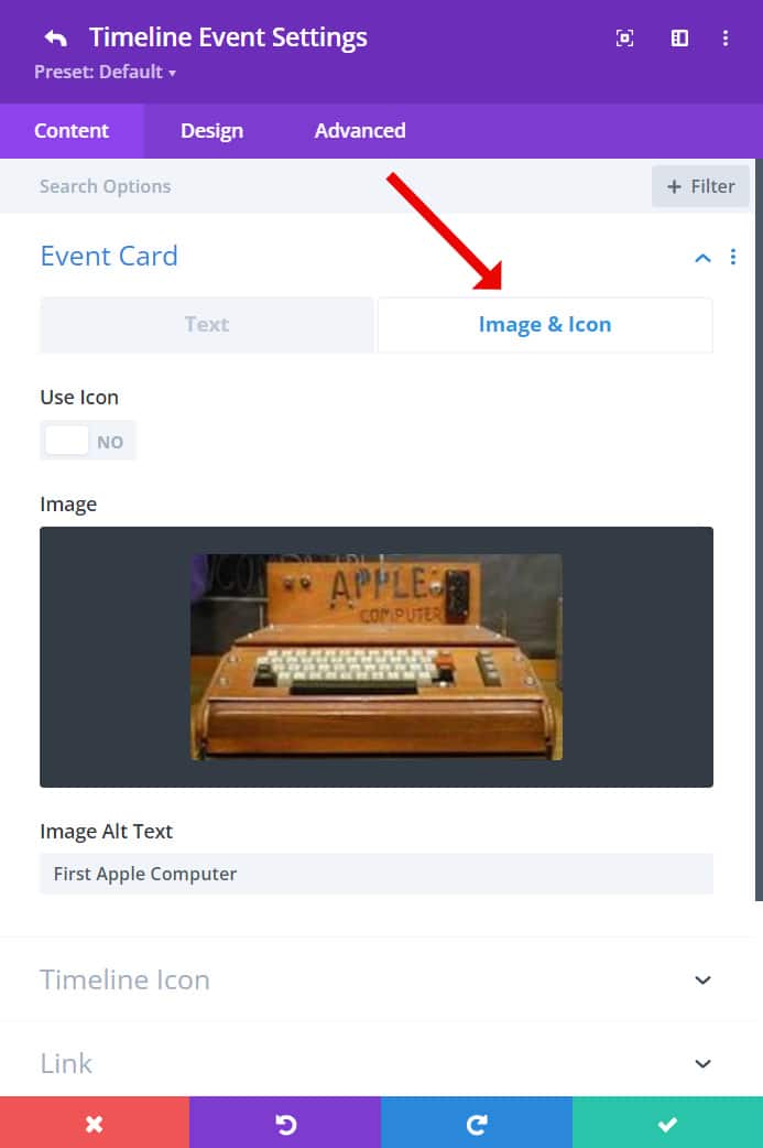
1. Image & Icon settings: On this tab, you can add an image or icon within the card event content.
2. Use Icon: by enabling it, you can select an icon instead of an image.
3. Image: select the image you want to add within the card content.
4. Image Alt Text: Alternative text of the image.
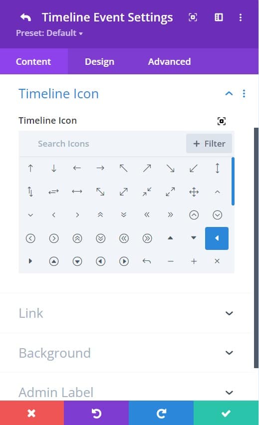
1. Timeline Icon: here you can select any icon on the Divi Library that will be added to the event dot.
Timeline – Design Tab
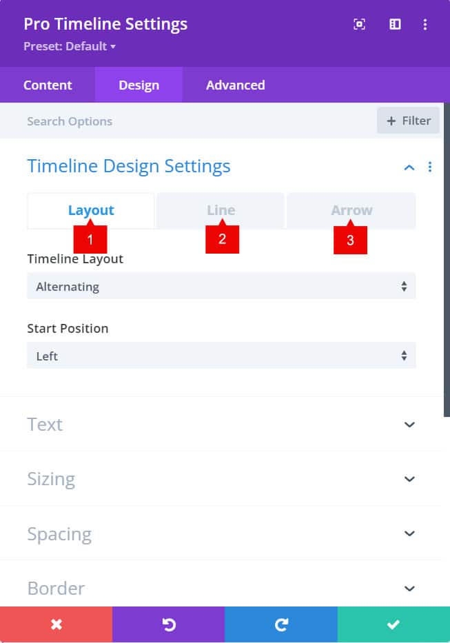
Timeline Design settings
1. Layout: selec the layout you want for the timeline. All card events aligned to the left, to the right or alternate.
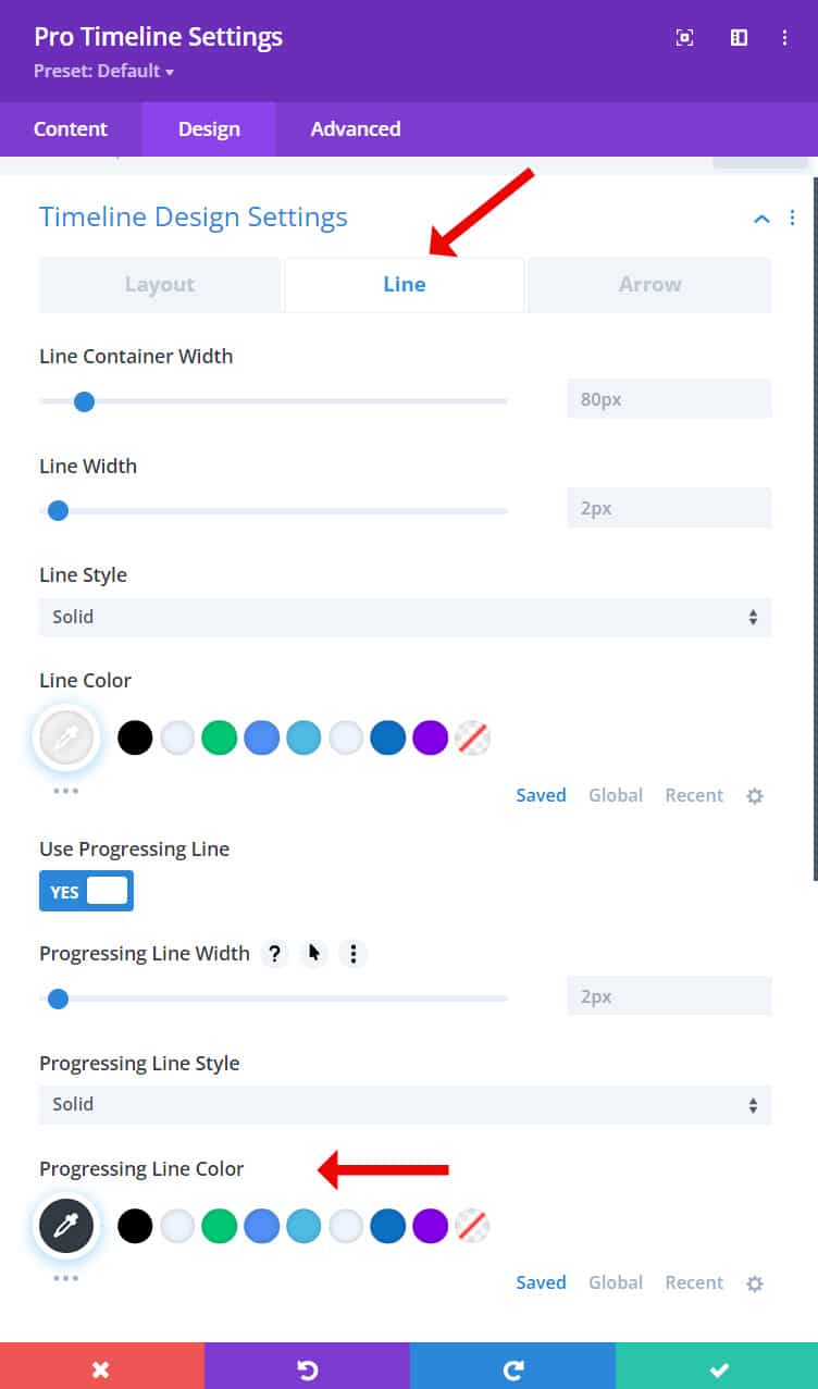
2. Line: Style the line of the timeline. Color, width, progressive line, line style, etc. Here you can style the color of the progressive line too.
3. Arrow: Universal settings for the arrows style (color and icon size)
Event Card desgin tab
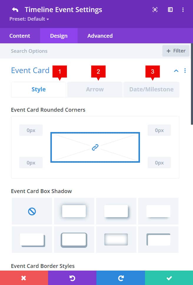
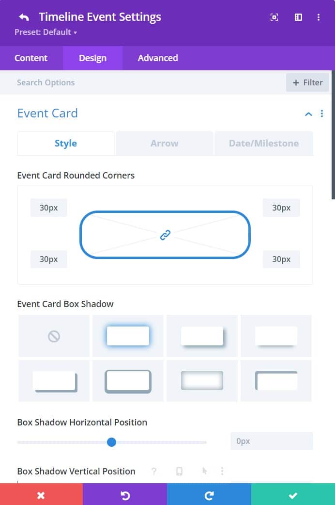
1. Event Card Style: shadows, border radius and border styles.
2. Arrow styles: Size and color of the arrow
3. Date/MIlestone: background color, border radius and border styles
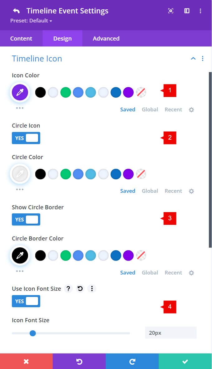
Event Icon desgin tab
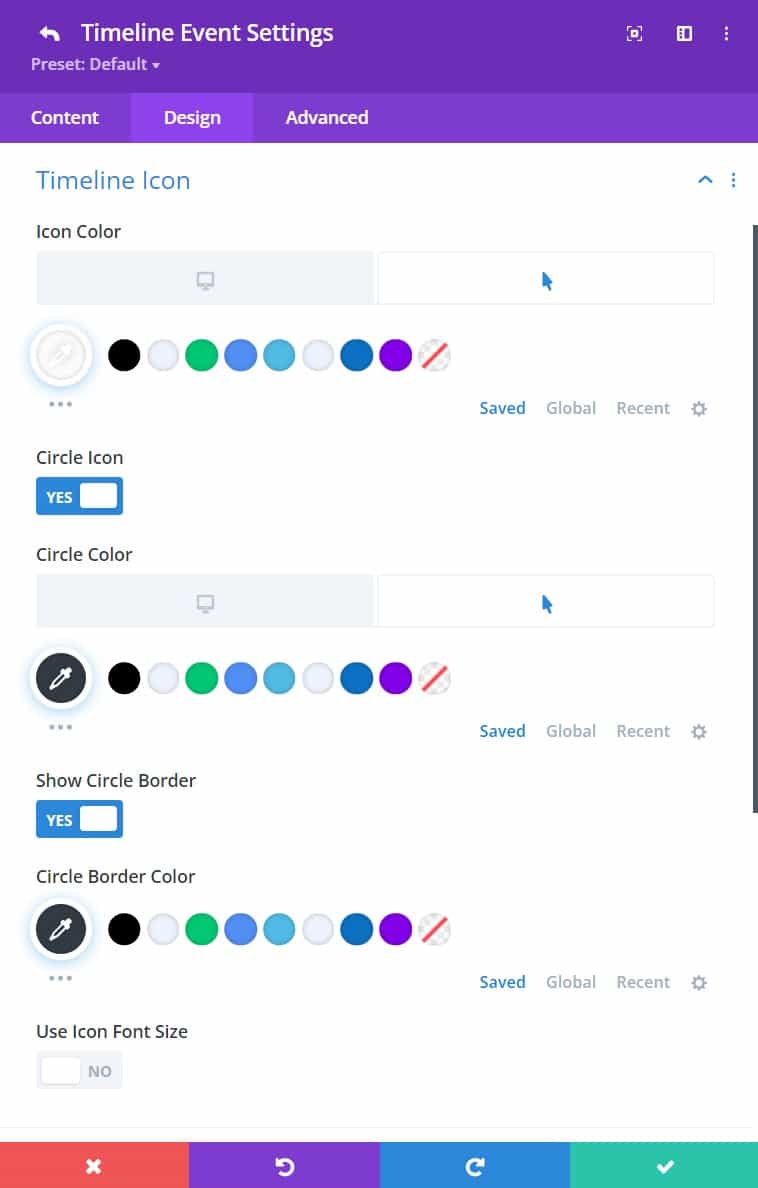
1. Icon Color: add a color to the icon on each event dot.
2. Circle Icon: Size and color of the arrow. It is important to set a hover color. The active color of the active card will be the color of the hover color
3. Circle Border: Adds a border to the event icon, once enabled, it allows you to set a color.
4. Icon Font Size: Set a custom size to the icon
Timeline – Advanced Tab
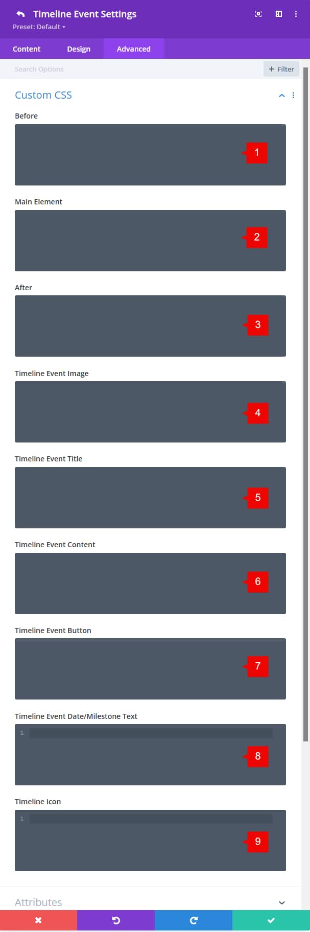
You can add custom CSS to the module. In fact, the timeline module only has three selectors: Before, Main and After.
Anyway, every single card event item has more selectors where you can add custom CSS.
1. Before: here you can add any custom CSS to the pseudo element. This is used to add icons or any CSS to add a style to the before pseudo element.
2. Main Element: Style the current timeline event card.
3. After: here you can add any custom CSS to the pseudo element. This is used to add icons or any CSS to add a style to the after pseudo element.
4. Timeline Event Image: add custom CSS to the Event Image (the image/icon) added within the event card.
5. Timeline Event Title: add custom CSS to the event title. Here you can add custom text styles not provided by the Divi builder.
6. Timeline Event Content: add custom CSS to the event content. Add more styles, animated background, and more.
7. Timeline Event Button: add custom CSS to the button added within the card content.
8. Timeline Event date/milestone text: add custom CSS to the date of the event. Here you can add more styles to the date text, as padding.
9. Timeline Icon: add custom CSS to the timeline icon. Add more padding, custom background, and more.
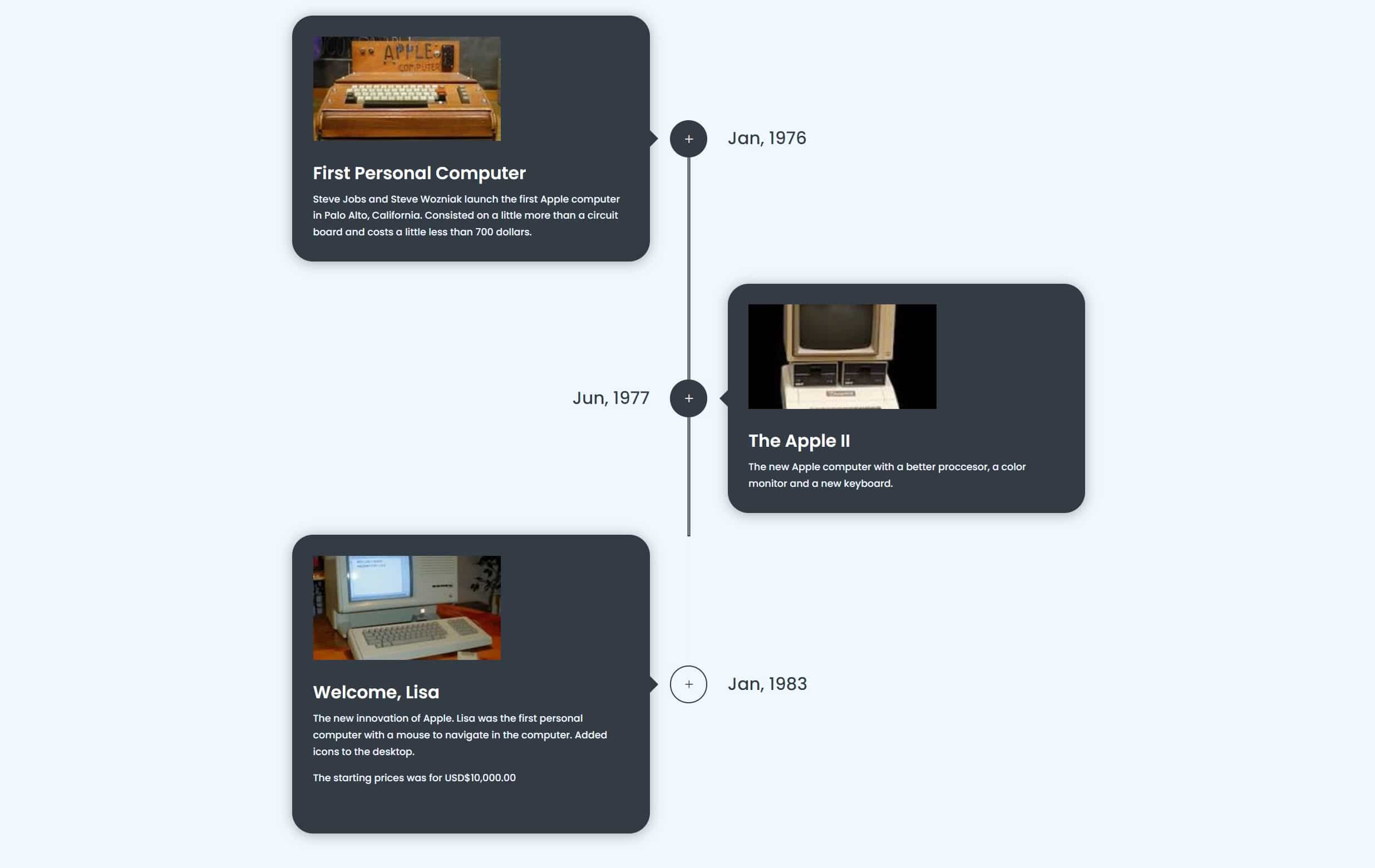
Step 2: Use Case Tutorial
Let’s add a new Timeline module to our layout.
For general settings, we’ll keep the “Show event card arrow” enabled.
Adding a timeline event
When you add a new event card, you need to fill the Date, the Event Title and a description of the event. For this tuto we won’t use the event button, so we will keep it disabled.
Adding an image to the card event.
When you add events, sometime you may want to add images to each event, and that’s easy to do. Let’s change to the “Image & Icon” tab, and there we can add an image or icon.
Styling the card event.
Now we have the content of the first event card, then we can style it as we need it. Then we can just duplicate the first event card and then change the content of the next event cards. For this tuto, we’ll do this:
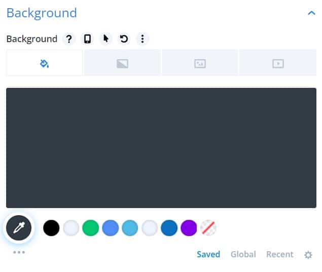
- Add a background color to the event card. The color we’ll be using is: #333b44

- Add border-radius and a box-shadow to the card content. This is on the design tab > Event card > Style

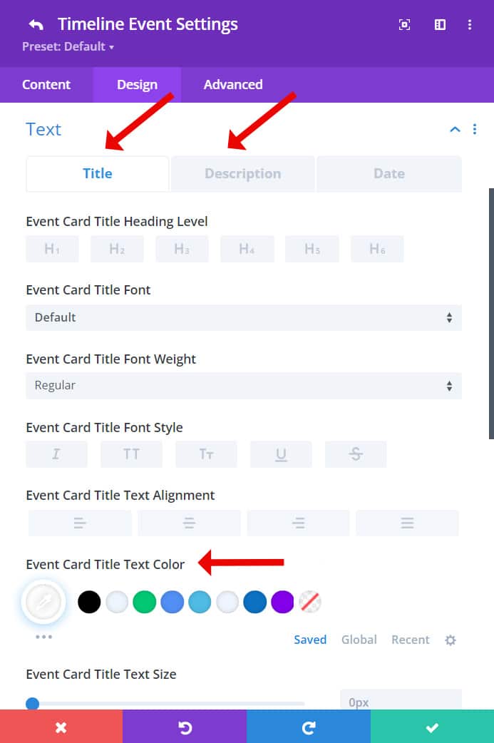
- To the content (title and description) style, go to the design tab > text > Title & Description

- Style the arrow of the card content. Go to design tab > arrow > use custom styles for event card arrow > change the color:

Styling the Timeline Icon
The timeline icon is the icon that is between the card event and the date/milestone. By default, the active/hover color of the icon is purple, but this can be easy changed to a custom color.
On the event card settings > go to the design tab > Timeline icon
**IMPORTANT: The color of the active card event should be set on the hover color of the items.
For this tuto, the styles of the icon are:
- Icon color: #333b44
Icon color on hover: #ffffff - Circle Icon: transparent
Circle Icon on hover: #333b44 (this will be the color of the active cart item) - Circle border: #333b44
Here we have finished to style the single Card Event. Now, you can duplicate this card event to add more events with the same styles.
Then just change the content (title, description, date, image/icon).
Styling the Line
When you scroll down, the line will fill until the next event. To style the color of the progressive line, go to the Timeline settings > Design tab > Timeline Design settings > Line tab
Final result