Introduction
With the Divi Hover Box Module, you can add content and change the content on hover with awesome animations. It’s a very sleek way to display content. In this tutorial, we’re going to show you how to add the Hover Box module to your website and give you an overview of the options and settings. Then, we’re going to give you a step by step tutorial on how to create an awesome Hover Box example!
Step 1: Add a new module
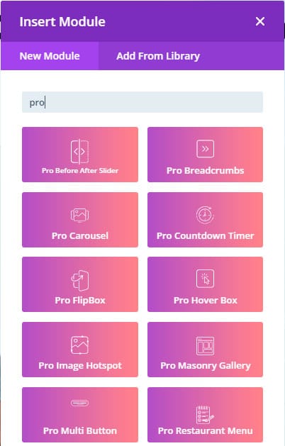
1. Enable Divi Builder and add a new Module > Search for “Pro Hover Box”.

Pro Hover Box Module – Content tab
1. Default Box Text: Add the text of the static box.
2. Hover Box Text: Add the content of the box on hover.
3. Hover Box Settings: Adjust the animation settings (type of animation, speed, position), position of the text and height of the content box.

Pro Hover Box Module – Design tab
1. Default Box Background: Add a background color to the front box.
2. Hover Box Background: Add a background color to the back box.
3. Default Image & Icon: Add borders, rounded borders, and box shadows of the image/icon of the front box.
4. Hover Image & Icon: Add borders, rounded borders, and box shadows of the image/icon of the back box.
5. Default Text: Style the text of the front box.
6. Hover Text: Style the text of the back box on hover.
7. Hover Button: Style the button of the back box.

Step 2: Use Case Tutorial
Now that we’ve shown you all the settings and options for the Hover Box module, we’re going to give you a step by step tutorial on how to create this example:
1. Add a new Hover Box module
- Add the front content and the back content


2. Change the hover effect in the settings section. In this tutorial, we will use the Zoom animation effect.

3. Style the front and back box
- Front box background: #4b83b3
- Back box background: #dddee2
- Icon size: 80px
- Front title color: #ffffff
- Front title size: 50px
- Front Description text color: #ffffff
- Back box button background color: #2B4A64
- Back box button color: #ffffff
That’s it, we’re done!
