
Introduction
The Divi Flipbox Module (sometimes known as Flip Cards) is a great way to show additional content to the user on hover. You can elegantly flip the module to show additional info on the back. In this tutorial, we’re going to give you an overview of all the options and settings included with the Divi Flipbox module, then we’ll show you how to create an awesome example.
Step 1: Add a new module
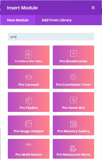
1. Enable Divi Builder and add a new Module > Search for “Pro FlipBox”.
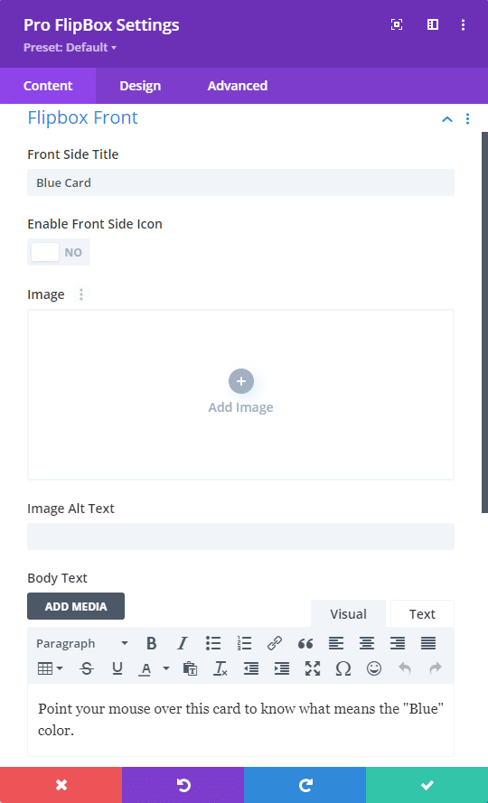
Pro FlipBox Module – Content tab
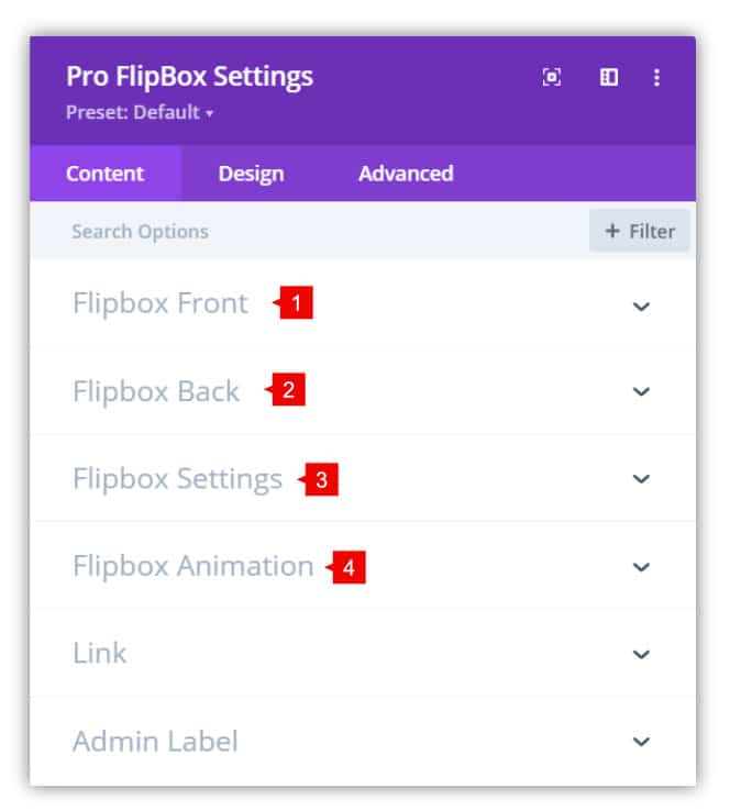
1. Flipbox Front: Add the content of the front face of the flip box. Here you can add:
- Front side title
- Front side icon (above the title)
- Image (above the title)
- Description
- Add a button
2. Flipbox Back: Add the content of the back face of the flip box. Here you can add:
- Back side title
- Back side icon (above the title)
- Image (above the title)
- Description
- Add a button
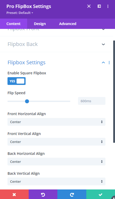
3. Flipbox Settings:
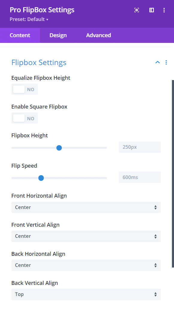
- Equalize FlipBox Height: by enabling this, the height of the front and back will be the same.
- Enable Square FlipBox: creates a flip box with the same width and height of the wrap.
- FlipBox height: adjust the height of the flip box.
- Flip speed: adjust the speed of the animation.
- Font Horizontal Align: Horizontal position of the content in the front.
- Font Vertical Align: Vertical position of the content in the front.
- Back Horizontal Align: Horizontal position of the content in the back.
- Back Vertical Align: Vertical position of the content in the back.
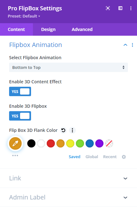
4. Flipbox Animation:
- Animation of the flip box: select the direction of the animation.
- Enable 3D content effect: add 3D effect to the content (title, icon, image and description)
- Enable 3D flip box: add 3D effect to the Flip animation.
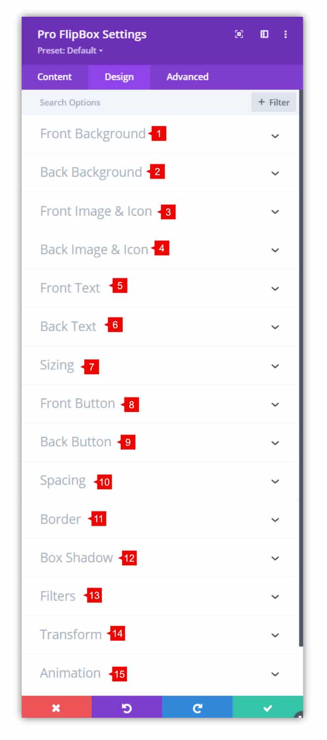
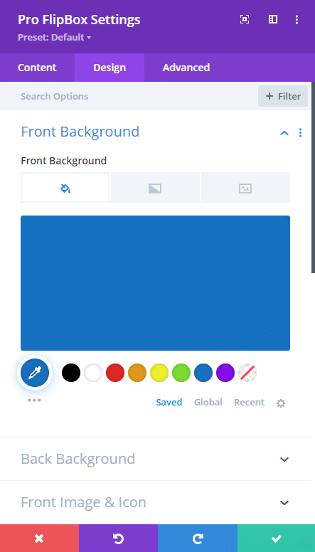
Pro FlipBox Module – Design tab
1. Front Background: Add a color, gradient or image background of the front flip box.
2. Back Background: Add a color, gradient or image background of the back flip box.
3. Front Image & Icon: Add border-radius, border and box-shadow of the image or icon in the front flip box.
4. Back Image & Icon: Add border-radius, border and box-shadow of the image or icon in the back flip box.
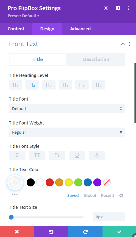
5. Front Text: Style the text of the front flip box.
6. Back Text: Style the text of the back flip box.
7. Sizing: change the sizes of the images and module.
8. Front button: style the button of the front flip box.
9. Back button: style the button of the back flip box.
10. Spacing: change the margin and padding values.
11. Border: Add borders to the module
12. Box Shadow: Add a shadow to the module, not each button. To add a shadow to each button, you need to go to the button settings > design tab > box shadow,
13. Filters: Add filters to the module.
14. Transform: Use the transform options.
15. Animation: Add animation to the module.
Step 2: Use Case Tutorial
Now that we’ve given you an overview of the settings and options for the module, we’re going to show you step by step how to create the following example:
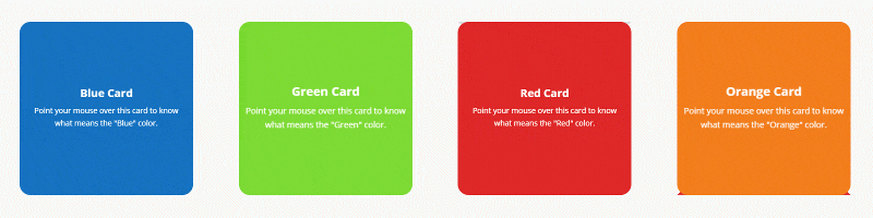
Let’s get started!
1. Add the content for each side of the flip box (Front and Back). In this tutorial, we’ll use colors. You can use images in the background, add icons or images.
2. Enable Square Flipbox to have the same width and height of the card. This is relative to the size of the columns.
3. Add a background to each face of the flip box (front and back)
4. Style the title and description text to show a contrast with the background. In this case, we are using color #FFFFFF
Save changes. Repeat the same steps or duplicate the modules to add more flip box modules, also you can play with the animations to add awesome effects.
These are the final results