
Introduction
With Divi Modules Pro you can add gorgeous carousels using content from the Divi Library or using content created within the module. In this tutorial, we will show you how to add the Divi Carousel module and give you an overview of all the settings and options. Then, we will give you a use case tutorial and the steps taken to reproduce the example.
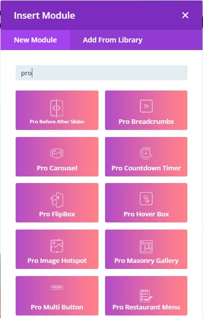
Step 1: Add a new module
1. Enable Divi Builder and add a new Module > Search for “Pro Carousel”.
Pro Carousel Module – Content tab
1. Add carousel items by clicking on the “+” icon.
2. Number of Columns: Set how many carousel items will be shown. Use the responsive options to adjust how many columns will be shown on tablet and mobile.
3. Spacing: Adjust the space between each carousel item.
4. Transition Effect: Select animation for the transition of the carousel.
5. Transition Duration: Set in milliseconds how much time will take the transition.
6. Enable Carousel Loop: enabling this, the carousel will infinitely loop.
7. Enable Carousel Autoplay: Enabling this the carousel will run automatically.
8. Enable Carousel Navigation: Enabling this will enable the arrows.
9. Enable Carousel Pagination: Enabling this will enable the carousel dots.
10. Enable Centered Carousel: Enabling this, the carousel will start with the first carousel item.

How to Add Carousel Items
There are two ways to add carousel items with the carousel module:
- Default: It will add a content card where you can use a custom icon, title, description, button, and a background.

- Divi Library: you can call any layout, section, row, or module from the Divi Library. This opens up loads of possibilities for unique carousels!


Step 2: Use Case Tutorial
Now that we’ve given you an overview of the settings and options for the Divi Carousel module, we’re going to show you step by step how to create the following example:

Let’s get started!
1. Add the new Pro Carousel Module to your page. In this tutorial, we’ll show you the two ways to add content to the carousel.
- Using the default content type: this allows us to add content similar to a blurb module (title, description, button, image/icon). You can use an icon or image that will be above the content.
- Add all the items you want for your carousel.

2. Let’s add some additional settings to the carousel
- Number of columns: 3 for desktop, 2 for tablet, and 1 for mobile (hover over the settings title and click the phone icon to display the options for mobile and tablet).
- Transition effect: Coverflow
- Slider shadow: disabled
- Enable Carousel Loop
- Enable Carousel Navigation

3. Style the carousel cards:
- Carousel Text:
- Title Font: Roboto
- Title text color: #25b569
- Carousel Item
- Rounded Corners: 20px
- Box Shadow:
- Carousel Navigation:
- Custom Prev Nav Icon
- Custom Next Nav Icon
- Arrow Color: #ffffff
- Arrow background: #25b569
- Enable Circle Arrow
- Button styles
- Text color: #ffffff
- Button background: #25b569
- Birder width: 0px

This is the final result: