
Introduction
We’re extremely happy to announce our new Content Toggle Module, an easy way to create content toggle using the Visual Builder and calling any design you want from the Divi Library.
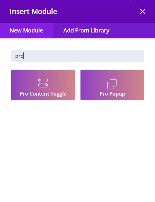
Step 1: Add a new module
1. Enable Divi Builder and add a new Module > Search for “Content Toggle”.
(make sure the Content Toggle Module is enabled under the Divi Modules Pro Control Panel)
Content Toggle – Content Tab
1. First/Second content: Select which content you want to add/edit.
2. Content type: Select between plain text/shortcode or use any layout from the Divi Library

Content Toggle – Design Tab
1. Toggle Switch: Style the switch icon (color, background color, size.)
2. First Title: Style the text of the first option title (color, font size, line height, etc.)
3. Second Title: Style the text of the second option title (color, font size, line height, etc.)
4. First Content: Style the content of the first option (background color, font size, color, etc.)
5. Second Content: Style the content of the second option (background color, font size, color, etc.)

Step 2: Use Case Tutorial
Now that we have the basics covered, let’s show you how to create something awesome!
- Create each content of the toggle. Go to Divi > Divi Library > Add new > Section
- Create and style each layout for the content toggle.

2. Add a new content toggle module

3. Add the content of each content toggle
- Add the title
- Content type: Divi Library
- Select Divi Library Layout: Select your first layout previously created on the Divi library.

Do the same for the second content.
4. Styling the toggle
- Go to the design tab > Toggle switch:
- Toggle switch right background: #7cda24
- Design tab > First/Second Title:
- Heading color: #7cda24
Save changes.
Final result:
